Upstox Originals
How relative rotation can help you invest smarter

4 min read | Updated on December 24, 2024, 19:41 IST
SUMMARY
Relative rotation graphs (RRGs) make it easier to track the markets and generate alpha! They let you compare multiple securities at once, showing their moves in four easy-to-understand quadrants—Leading, Weakening, Lagging, and Improving. If you spot a stock moving from one quadrant to another, it could be your cue to enter or exit. Read on to learn more.

Relative rotation graphs make it easier to track the markets
Relative Strength (RS) measures the performance of a security compared to a benchmark or peer group over a specific period. It highlights whether a security is outperforming, underperforming, or moving in line with the comparison index. RS is a cornerstone in technical analysis, used to identify strong and weak performers in the market.
This analysis aids in spotting emerging trends and shifts in momentum, guiding investors and traders toward more informed decisions for portfolio allocation and alpha generation.
Limitations of traditional relative strength analysis
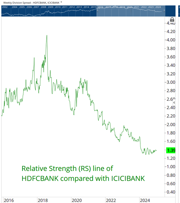
Traditional Relative Strength (RS) is effective for evaluating the performance of one security against a single benchmark (or comparing one stock versus another, as seen in the chart below).
However, a key shortcoming is that it falls short when analysing relationships among multiple constituents. The process becomes cumbersome and time-intensive as it requires individual pairwise comparisons. Additionally, traditional RS lacks a dynamic, visual representation of performance shifts, making it challenging to track evolving trends. This restricts its usefulness in identifying broader sectoral or intermarket rotations.
HDFC Bank versus ICICI Bank - Relative strength comparison
Source: Optuma
Enter: Relative Rotation Graphs (RRGs)
Relative Rotation Graphs (RRGs) are a powerful visualisation tool designed to compare the relative performance of multiple securities or asset classes simultaneously. Introduced by Julius de Kempenaer, RRGs simplify the analysis of relative strength and momentum by plotting securities on a graph with four quadrants—Leading, Weakening, Lagging, and Improving. This framework enables investors to track how securities rotate through different phases of relative performance over time.
Understand the construction of RRGs
RRGs are four-quadrant charts. The X-axis represents relative strength, while the Y-axis represents relative momentum. Securities move clockwise through four quadrants: Leading, Weakening, Lagging, and Improving, visualising shifts in performance and trends over time in a clear and intuitive way.
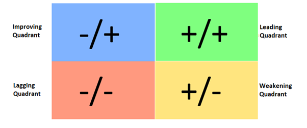
RRGs allow users to identify trends, sector rotations, and opportunities efficiently, addressing the limitations of traditional pairwise comparisons.
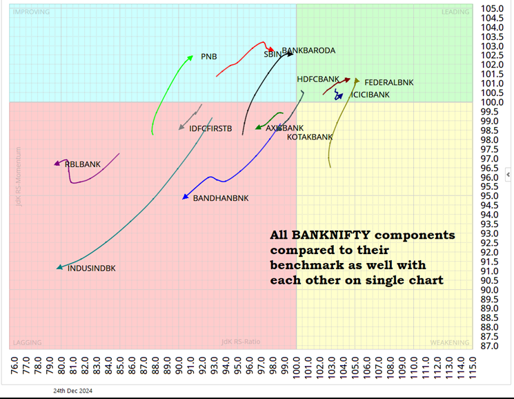
In the chart below – we present an analysis of select banking stocks. As you can see, not only is it easy to understand where each stock currently stands, an investor can compare multiple stocks at the same time.
Source: Optuma
Leveraging quadrant crossovers for alpha generation
When a security transitions, for example, from the Lagging quadrant to the Improving quadrant, it often marks the early stage of a phase where the stock begins to outperform its benchmark. Conversely, a transition into the Weakening quadrant may indicate the onset of underperformance.
The approach enables traders and investors to identify opportunities early, enhancing portfolio performance through a systematic evaluation of quadrant crossovers on the RRG.
Identifying quadrant crossovers in Nifty 500 components
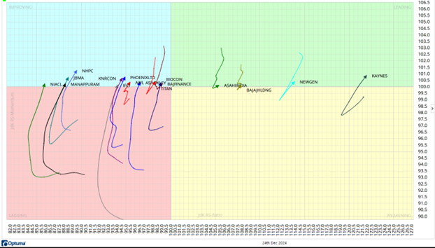
The chart below showcases the RRG for Nifty 500 components, highlighting stocks confirming quadrant crossovers. Stocks in the Leading quadrant could have a strong momentum and relative strength, often linked to significant outperformance. Stocks transitioning into the Improving quadrant from Lagging, suggest the onset of a potential outperformance phase.
The distance from the chart’s center is crucial. The farther a stock is from the center, the stronger its relative momentum and strength, implying greater alpha-generation potential. This visualisation helps investors spot opportunities early and align their strategy with stocks showing robust quadrant dynamics. Stocks transitioning into Improving and Leading quadrants deserve closer analysis for actionable entry points.
Source: Optuma
In conclusion, Relative Rotation Graphs (RRGs) offer a dynamic and insightful approach to evaluating relative performance and momentum across multiple securities. By visualising quadrant crossovers, investors can effectively identify opportunities for alpha generation, leveraging the transitions between phases of outperformance and underperformance.
The ability to simultaneously analyse numerous securities in a single framework makes RRGs an indispensable tool for portfolio management and tactical decision-making.
Please note:
-
None of these are stock or sector recommendations and investors are urged to conduct their own individual research before taking any decisions.
-
“Relative Rotation Graphs®” and “RRG®” are registered trademarks of RRG Research.
About The Author
Next Story
