Understanding Stock Chart as a Beginner
Written by Pradnya Surana
Published on November 20, 2025 | 4 min read


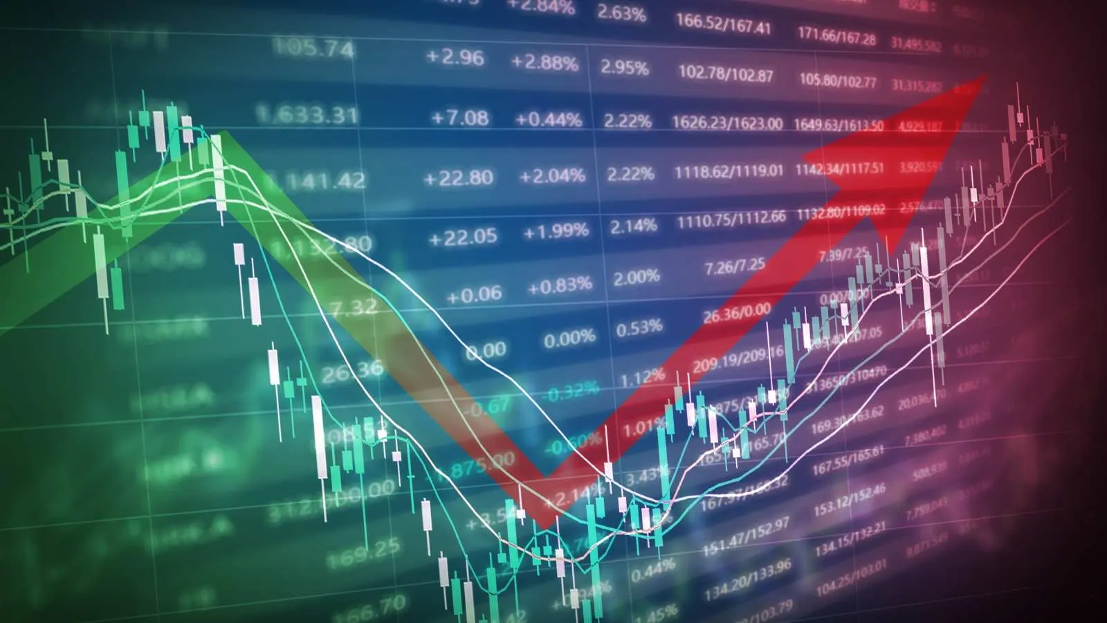
A picture is worth a thousand words and stock charts are no different. Full of lines, colours and some unique patterns, they can look intimidating to a beginner. But once you get the basics, they can help you towards appropriate decision making. If you have ever wondered how seasoned stock market investors make quick buying and selling decisions, the answer is, most of them can read stock charts efficiently.
What is a stock chart?
A stock chart is a picture, a graphical depiction that shows how a stock's price has moved over time. The chart helps you see if a stock is going up, going down or staying flat. When you apply science to them, they are visual representations of market psychology, trends and opportunities. While fundamental analysis focuses on a company’s financial health, technical analysis, which is enabled by stock charts, examines price action and market behaviours.
Primary elements of a stock chart
Before understanding charts and their types, lets get to know their basic components,
Price axis
Or Y axis. Located on the right side, it shows the stock’s price levels.
Time axis
Or X axis. Runs along the bottom, representing the time frame. Can be minutes, days, weeks or months.
Volume bars
Usually displayed below the price chart, volume shows how many shares were traded during a specific period.
Trend Lines
These lines connect price points to show the overall direction, uptrend, downtrend or sideways.
Types of Stock Charts
To begin with, let’s look at the most common chart types
Line chart
The simplest form, showing the closing price over a period. It is good for beginners. However, it lacks detailed information like highs, lows and volume.
Bar chart
Displays opening, closing, high and low prices for each time period
Candlestick chart
The most popular among traders. Each ‘candle’ shows the open, high, low and close prices, with colours indicating bullish (price up) or bearish (price down) movements.
Understanding Candlestick Charts
Since candlesticks are most commonly used, let's understand them better.Each candlestick represents a specific time period, be it, minute, hour or day The rectangular part is called the ‘body’ and the lines sticking out are called ‘wicks’ or ‘shadows’.
-
Green (or White) candles Indicates the stock went up. The bottom of the body shows the opening price and the top shows the closing price.
-
Red (or Black) candles Indicates the stock went down. The top shows the opening price and the bottom shows the closing price.
The wicks show the highest and lowest prices reached during that period. For example, a green candle with a long top wick means the stock reached higher but fell back before closing still up for the day, just not at the highest point it reached.
Spot trends and patterns
Patterns are the language of charts. Here are a few basics,
Uptrend
means higher highs and higher lows. This indicates bullish sentiment.
Downtrend
means lower highs and lower lows. Signals bearish sentiment.
Support and Resistance levels
As you look at charts, you will notice that stocks often bounce off certain price levels.
-
Support This is a price level where the stock usually stops going down and bounce back up. It's like a floor. Buyers think the stock is a good deal at this price, as its floor level prices are expected to go up from here.
-
Resistance This is a price level where the stock usually stops rising and falls back down. It's like a ceiling. So when stock price reaches its ceiling, sellers tend to sell anticipating decline in stock prices after it has reached ceiling.
These levels are important because they help you predict where a stock might change direction.
Trade volume is important
Most charts show volume at the bottom, usually as vertical bars. Volume tells you how many shares were traded during each period. High volume means lots of people are buying and selling.
This usually happens when important news comes out or when a stock makes a big move. High volume indicates high interest, which means a trend is strong.
Low volume means not many people are trading. Moves on low volume might not last because there is not much conviction behind them.
Time frames matter
A stock might be in an uptrend when you look at a one-year chart but in a downtrend on a one-month chart. Hence, time frame matters. Short-term traders look at minutes, hours or days. Long-term investors look at months or years. Choose the time frame that matches your investing time frame.

Final thoughts
Stock charts are not crystal balls, they cannot predict the future perfectly. But they do show you what has been happening and help you spot patterns. The more you practice reading charts, the more natural it becomes.
About Author
Pradnya Surana
Sub-Editor
is an engineering and management graduate with 12 years of experience in India’s leading banks. With a natural flair for writing and a passion for all things finance, she reinvented herself as a financial writer. Her work reflects her ability to view the industry from both sides of the table, the financial service provider and the consumer. Experience in fast paced consumer facing roles adds depth, clarity and relevance to her writing.
Read more from Pradnya


Upstox is a leading Indian financial services company that offers online trading and investment services in stocks, commodities, currencies, mutual funds, and more. Founded in 2009 and headquartered in Mumbai, Upstox is backed by prominent investors including Ratan Tata, Tiger Global, and Kalaari Capital. It operates under RKSV Securities and is registered with SEBI, NSE, BSE, and other regulatory bodies, ensuring secure and compliant trading experiences.
Related articles

Share Market
How the RBI Defends the Indian Rupee through Strategic Forex Intervention13 min read | Written by Bidita Sen

Share Market
Impact of Rupee Depreciation on the Stock Market3 min read | Written by Subhasish Mandal

Share Market
India's LPG Crisis Is the Wake-Up Call. Renewables Are the Answer6 min read | Written by Pradnya Surana


Share Market
What is the Difference Between Small Gain & Capital Gain?4 min read | Written by Dev Sethia

Share Market
Types of Stocks: Large Cap, Mid Cap, Small Cap Explained5 min read | Written by Pradnya Surana