Candlestick Chart Pattern in Trading - Analysis, Types, Engulfing, Basics, & How to read
Written by Upstox Desk
Published on September 01, 2025 | 5 min read

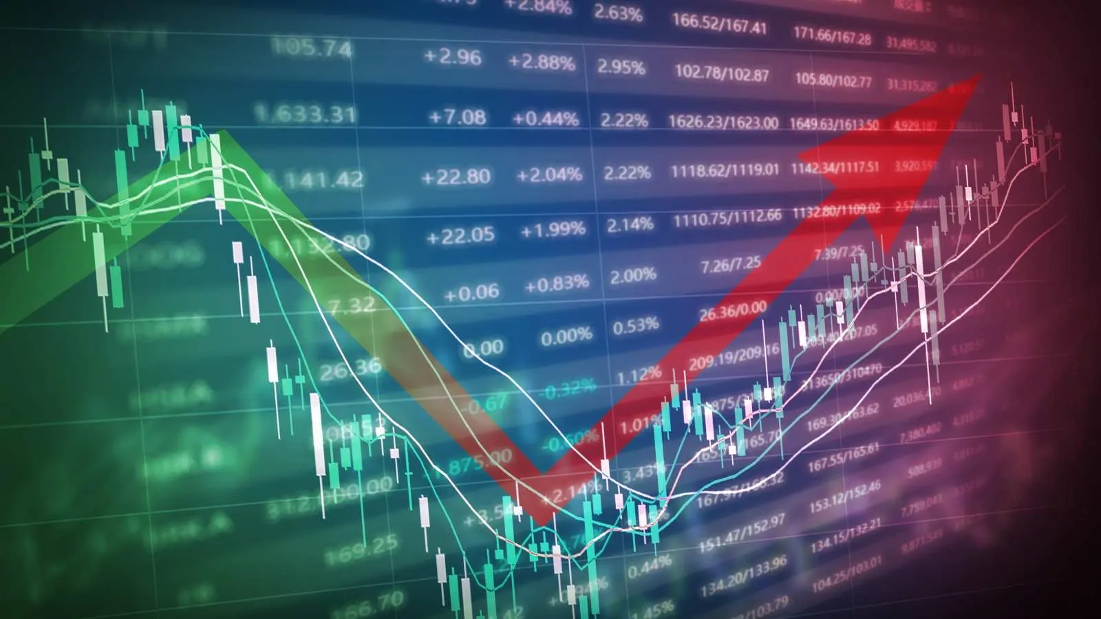
Intraday trading involves buying and selling equities within the same day, to close all positions by the end of the day. Traders benefit from tools like candlestick chart patterns. They try to buy low and sell high, or short-sell high and buy back at a lower price, requiring market knowledge and relevant data. The balance of supply and demand influences share prices. Candlestick charts help predict market trends, making trading more profitable and smoother.
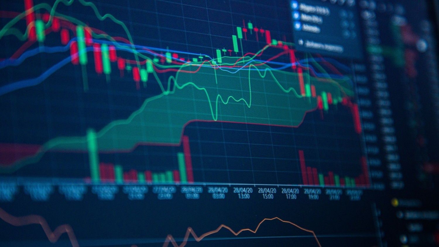
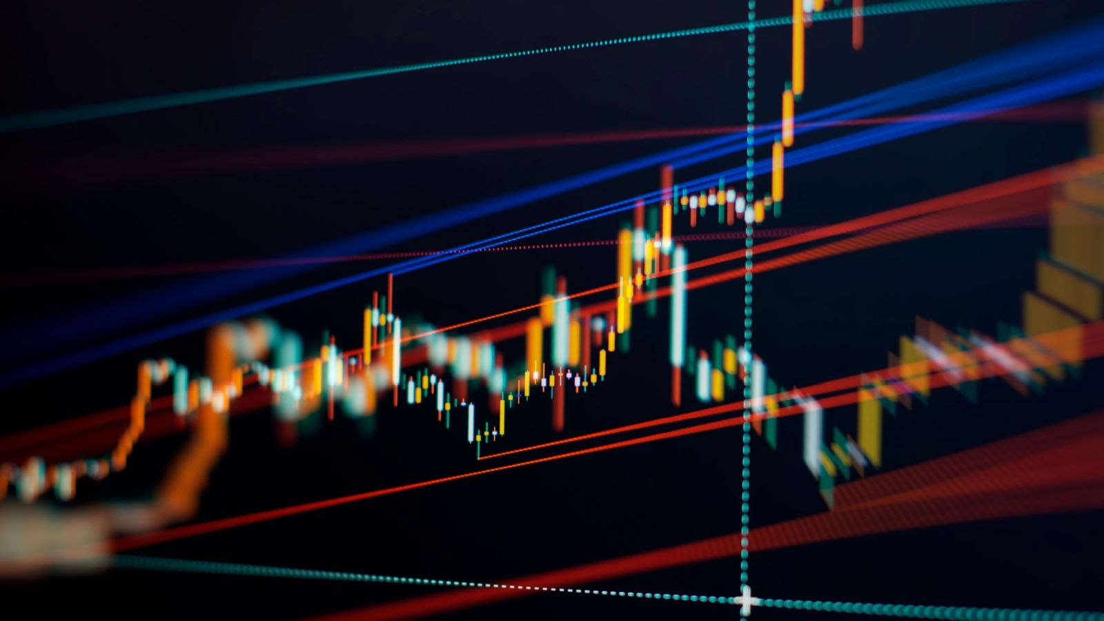
What Is A Candlestick Chart?
Candlesticks visually represent the magnitude of price fluctuations. Traders rely on these charts to detect patterns and assess the short-term direction of prices.
Composition of a Candlestick Chart
The composition is quite straightforward; if you see a candlestick graph, it consists of multiple horizontal bars. They are called candlesticks, which include three major parts:
- The body
- The upper shadow
- The lower shadow
Additionally, the body is colored either red or green. Each candle signifies a specific period, with data reflecting the trades made during that time.
Methods for Candlestick Chart Analysis
The candle's body displays opening and closing prices during trades, which are essential in candlestick trading. Traders can quickly view the price range for a stock over a specified period. The body's colour indicates whether the stock price is rising or falling. More red candles on a month-long chart suggest the price is declining.
The lows and highs of the stock's trading price are depicted by vertical lines known as wicks or shadows above and below the body. Here's an example:
- A red candle with a short upper wick indicates that the stock opened near the day's high.
- Conversely, a green candle with a short upper wick signifies that the stock closed close to the day's high.
A candlestick graph shows a stock's high, low, opening, and closing prices. The body can be green or red, and it can be long or short. Shadows can also vary. These factors reflect market sentiment. Understanding these details is crucial for accurately interpreting candlestick charts.
Candlestick Chart Patterns
Candle chart patterns help to understand investor sentiment, demand and supply, and market dynamics, such as bearish and bullish trends, as well as greed and fear. While a single candle offers info, recognising patterns depends on comparing candles. Traders need to understand candlestick patterns to utilise them effectively.
For better understanding, let’s divide the patterns into two sections:
- Bullish patterns
- Bearish patterns
Both patterns are essential for candlestick chart analysis.
Bullish Patterns
Hammer Pattern
It follows a decline, and the lower wick is long, while the body is small, indicating strong buying pressure following earlier selling pressure.
Inverse Hammer (HM)
Following a bearish trend, the formation is characterised by a small body and a long wick in the upper part, indicating that the reversal has the potential to become bullish as the forces of buyers increase.
Bullish Engulfing
Two candles in which there is a big green candle completely swallowing the small red one, which points at a high bullish momentum and reversal of trends.
Pattern of Piercing Line
Two-candle motif in which a green candle closes halfway above a preceding red candle and indicates strong interest in buying and reversal.
Morning star pattern
Three candle formation indicating the bearish overheat and bullish reversal, where there is a small-bodied candle in between long red and green candles.
Three white soldiers pattern
Three in a row green candles with an upward closing price and a tight wick, indicating that the buying was powerful enough and sustained, and momentum shifted to the bulls.
Bearish Patterns
Hanging Man Pattern
Appears after an uptrend, with a small body and long lower wick, signalling weakening bulls and increasing selling pressure.
Shooting Star Pattern
Forms after an uptrend, with a small body and long upper wick, showing a failed rally and rising bearish control.
Bearish Engulfing Pattern
Two-candle pattern where a large red candle engulfs a small green one, indicating a potential trend reversal to bearish.
Evening Star Pattern
The three-candle pattern indicates market hesitation and a bearish reversal, especially when the third candle erases the gains of the first candle.
Three Black Crows Pattern
Three consecutive red candles with lower opens and closes, indicating strong bearish momentum following an earlier bullish trend.

Conclusion
Candlestick chart patterns are essential in trading, offering visual insights into market trends, price movements, and investor sentiment. Mastering these patterns enables traders to make more informed decisions in both bullish and bearish markets. As you progress from novice to experienced, understanding candlestick patterns enhances your technical analysis and trading success.
FAQs
What is a candlestick chart in trading?
A candlestick chart is a type of chart that displays stock price action in a candlestick form, with the open, high, low, and close prices represented within a given period.
How do you read the candlestick patterns?
The candlestick reading is based on the shape and colour of the candles and the wicks to discern reversals and trend continuations.
What do the green and red candles represent?
The green candles indicate instances when the price has moved upward (close > open) during that time, and the red candles indicate cases when the price has moved lower (close < open) during that time.
What is a bullish candlestick pattern?
Bullish patterns indicate a potential upward trend, such as the Hammer, Morning Star, and Bullish Engulfing pattern.
Do candlestick patterns work for intraday trading?
Yes, as long as they're used in conjunction with other signals and executed properly, with risk management in mind, candlestick patterns provide sound information for intraday decision-making.
About Author
Upstox Desk
Upstox Desk
Team of expert writers dedicated to providing insightful and comprehensive coverage on stock markets, economic trends, commodities, business developments, and personal finance. With a passion for delivering valuable information, the team strives to keep readers informed about the latest trends and developments in the financial world.
Read more from Upstox


Upstox is a leading Indian financial services company that offers online trading and investment services in stocks, commodities, currencies, mutual funds, and more. Founded in 2009 and headquartered in Mumbai, Upstox is backed by prominent investors including Ratan Tata, Tiger Global, and Kalaari Capital. It operates under RKSV Securities and is registered with SEBI, NSE, BSE, and other regulatory bodies, ensuring secure and compliant trading experiences.
Related articles

Share Market
How the RBI Defends the Indian Rupee through Strategic Forex Intervention13 min read | Written by Bidita Sen

Share Market
Impact of Rupee Depreciation on the Stock Market3 min read | Written by Subhasish Mandal

Share Market
India's LPG Crisis Is the Wake-Up Call. Renewables Are the Answer6 min read | Written by Pradnya Surana
Share Market
What is the Difference Between Small Gain & Capital Gain?4 min read | Written by Dev Sethia

Share Market
Types of Stocks: Large Cap, Mid Cap, Small Cap Explained5 min read | Written by Pradnya Surana